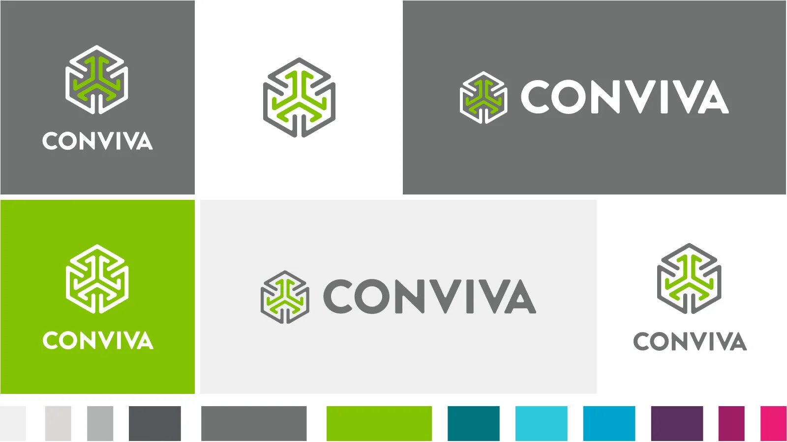
Conviva Re-Branding
rebranding . art directing . design
Conviva pioneered and continues to define the standards for cross-screen, end-to-end streaming media intelligence.
My job was to ensure the brand reflect the company mission and improve the brand recognition.
Logo Refresh
Challenge:
Brand recognition
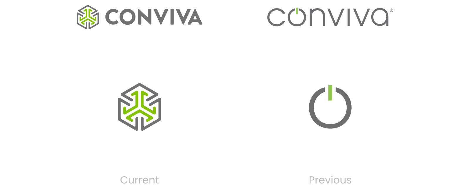
The weight of the logo text is light and delicate make it easily lost its visibility. The glyph of the “on switch” doesn’t symbolize anything relevant to our business or customers. The logo doesn’t scale effectively in space-constrained channels (like social)
Result:
Re-design the logo to reflect the core concept of Conviva platform — integrates intelligence from all of the viewer experience, ad, social and content initiatives, identifies cross-platform opportunities and taps into their multiplier effects at every level of the organization.

Website Re-Design
Challenge:
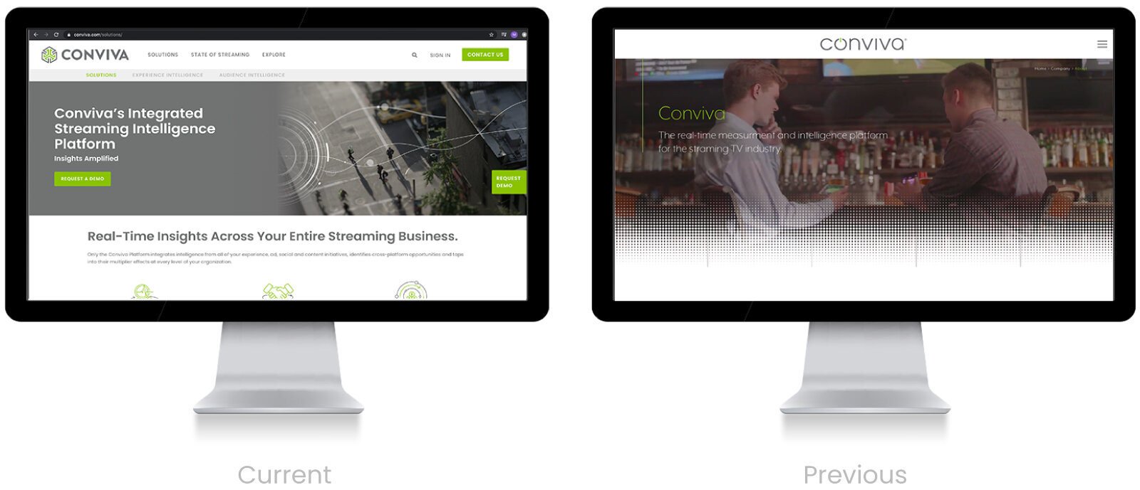
Dated look and feel; needs a facelift to present the company as an industry leader.
Needs an improved messaging strategy with a more hierarchical layout to facilitate client understanding.
Navigation needs an overhaul.
We are forcing users to search too hard for key messaging through our inelegant layout and several UI features require a click to get to small amounts of key information.
Visual style speaks as a B2C not a B2B.
Goal:
Converting a higher number of visitors and generating sales-ready leads for our sales team by presenting a clearer value proposition and buyer journey.
Our secondary goals are educating prospective buyers on our services and providing the right level of resources to help them sell internally to their stakeholders.
The tertiary goal is to continue to support Conviva’s industry-defining position.
A more modern, easily navigable, and effective site design that is visually engaging and functional on all screens.
Result:
- Easier access navigation helped increasing the page click by 3X.
- The on target branding increased the brand recognition and as well as the trust of the brand.

Refreshed Branding on Ad Banner
The ad banner with new branding addressed the mistake B2C image by eliminating the use of “happy user” in the visual and more focus on the intuitive dashboard.



Team
Mandy Chiang Art Direction / Designer
HKW Project Managing / Web Development
Paula Winkel Director of Corporate Marketing